Case study 02 · ra.co
Simplifying complex ticket purchases
Complex interactions & dependencies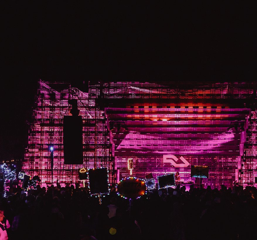
Background
A checkout built for club nights
Our checkout experience was a massive blocker for our revenue teams to secure festival accounts.
It was built for the typical club experience, but when stretched for more complex set-ups the customer experience would fall short.
We had previously relied on hard-coded and one-off solutions to get festivals over the line — but it was time to invest proper dev time into a flexible solution.
We had recently built ‘Ticket Groups’, a new way of grouping products on our new ticketing system, but we needed further complexity.
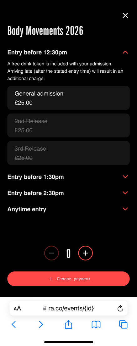
Grouped tickets on our new ticketing stack
The problem
- Our legacy checkout was built for club nights — one ticket type per purchase. Anything more complex broke UX principles.
- We had been relying on hard-coded and one-off solutions to win business (e.g. Dimensions Festival).
Impact
- Lower conversion
- Weak proposition for large promoters
- Bespoke is high effort and not scalable
The legacy checkout stretched to handle a complex festival
Exploration
A step-based strategy
We worked alongside our revenue, promoter solutions and product teams to align on a step-based strategy.
- Grouped tickets gives us the single-page version that works for simple festivals
- Multi-stepped should be an extension of our checkout for complex festivals — building on what we have with progressive capability
- We need the set-up to be flexible, as festival structures differ dramatically case to case
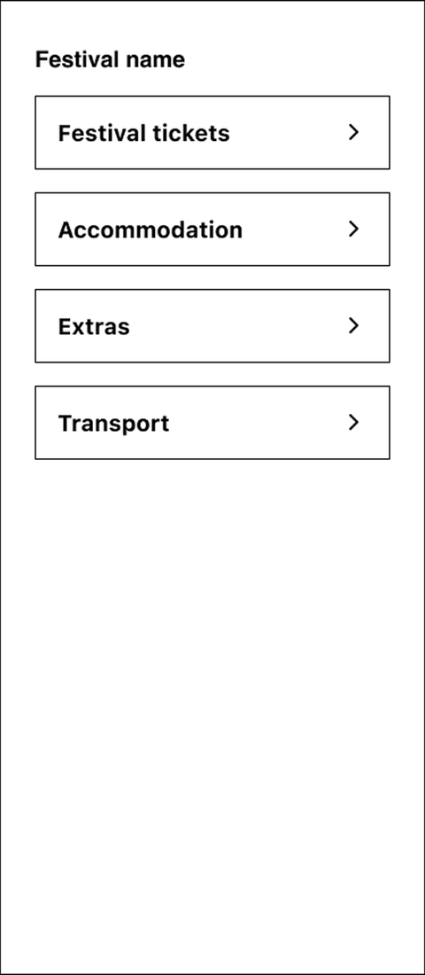
Hub — a menu of categories
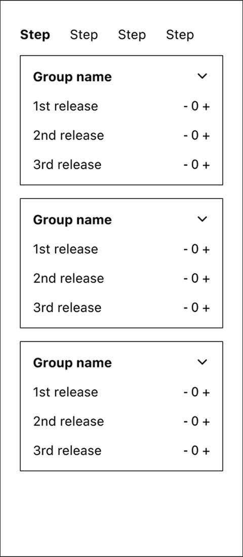
Step — sequential steps
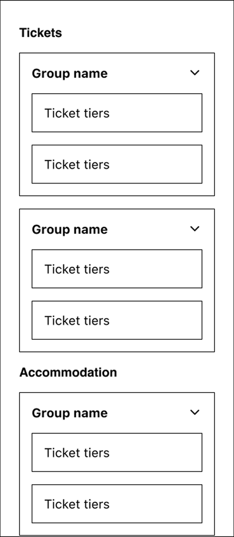
Single page — everything on one scroll
Systems thinking
Designing for nesting & dependencies
Festivals stack tickets, releases, groups and categories in different combinations. I mapped how the interface would need to flex as complexity increased — from a single counter to categories nested within steps.
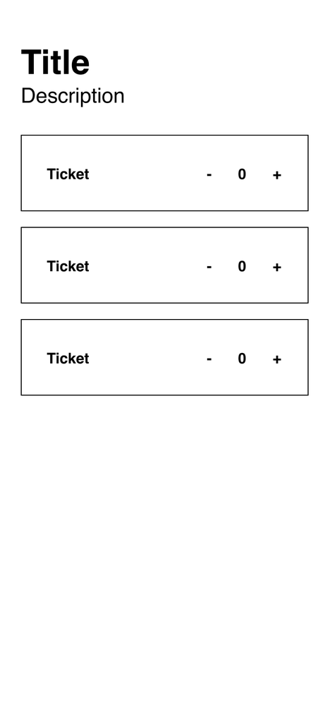
0 nesting — a counter per tier
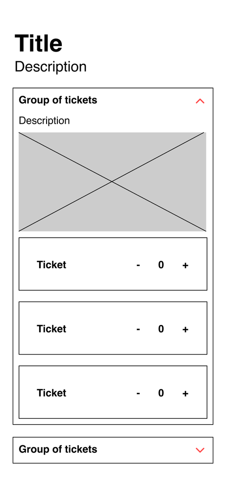
1 layer — groups are built
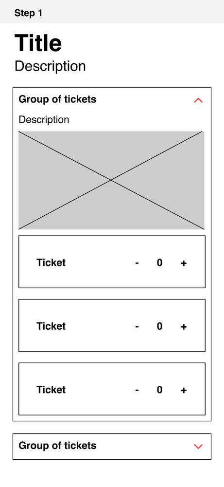
2 layers — adding steps
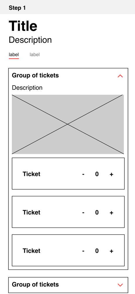
3 layers — categories in steps
Iterative testing
Stepper & basket
The main components we wanted to test and iterate on were the Stepper and the Basket. We tested a few key areas along the way to understand what was working and where users experienced friction:
- Do users navigate the stepper confidently, without hesitation or concern about losing their progress?
- Does the second layer of filtering feel intuitive and clearly contained within the relevant step?
- Do users understand how to edit their basket and make changes to their selections?
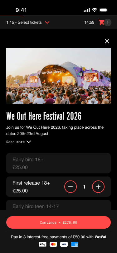
Stepper — selecting weekend tickets
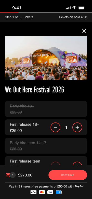
Iterating on hierarchy & clarity
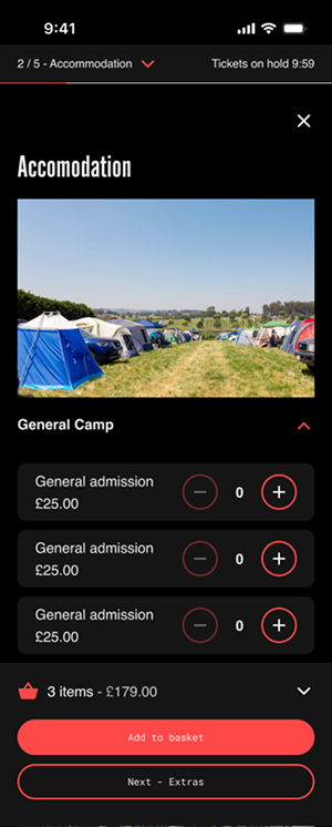
Images on groups — the accommodation step
The final experience
What we shipped
- Images on groups
- Multi-select on tickets
- Edit and view basket
- Stepper component
- Categories — a 2nd layer of filtering per step
⚠️ Still in development
This product is currently in development and is due to launch this month. As a result, I don't yet have sales or deal data to share.
The final multi-stepped checkout — a flexible, step-based experience for complex festivals
Reflection
What I would do differently
-
Validate across platforms earlier
We fell into the trap of prioritising mobile because that's where most of our users are. However, we hadn't tested desktop early enough, which led to some last-minute changes to the experience.
It was a good reminder to validate across platforms earlier, even when one platform is significantly more important.
-
You don't need to involve subject matter experts the whole time
Because this project was closely tied to our revenue team landing deals with larger festivals, their expertise was really important when it came to prioritisation. However, that input could sometimes extend beyond their area of expertise, particularly into product and UX decisions.
It was a valuable lesson in balancing stakeholder expertise with UX best practice — and knowing when to involve them and when to take ownership of the design decision.